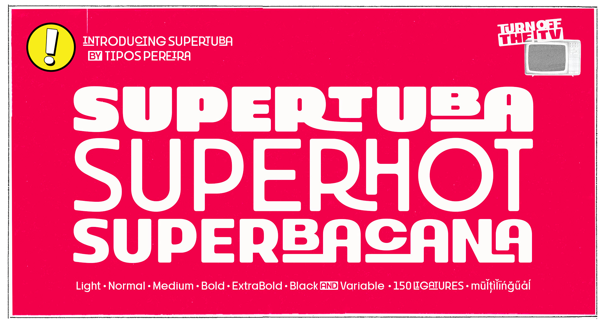
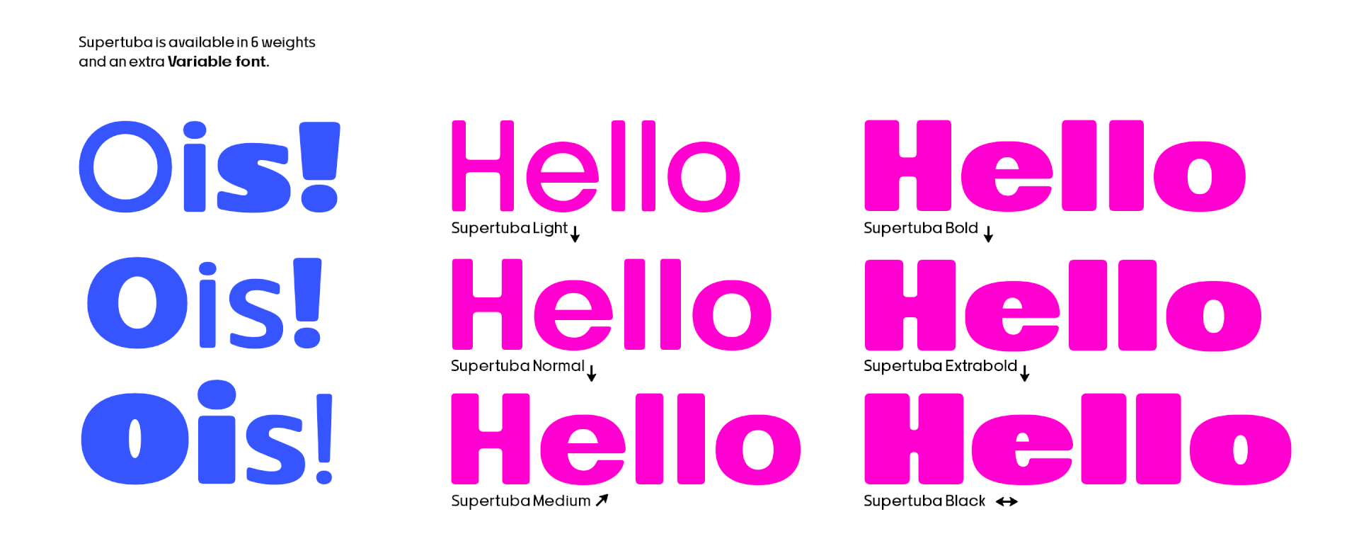
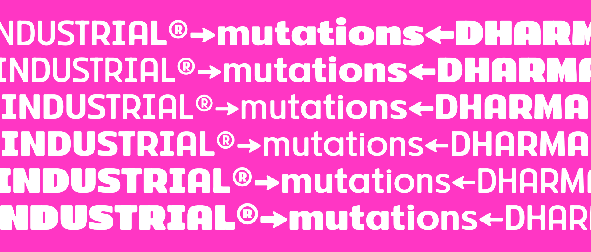
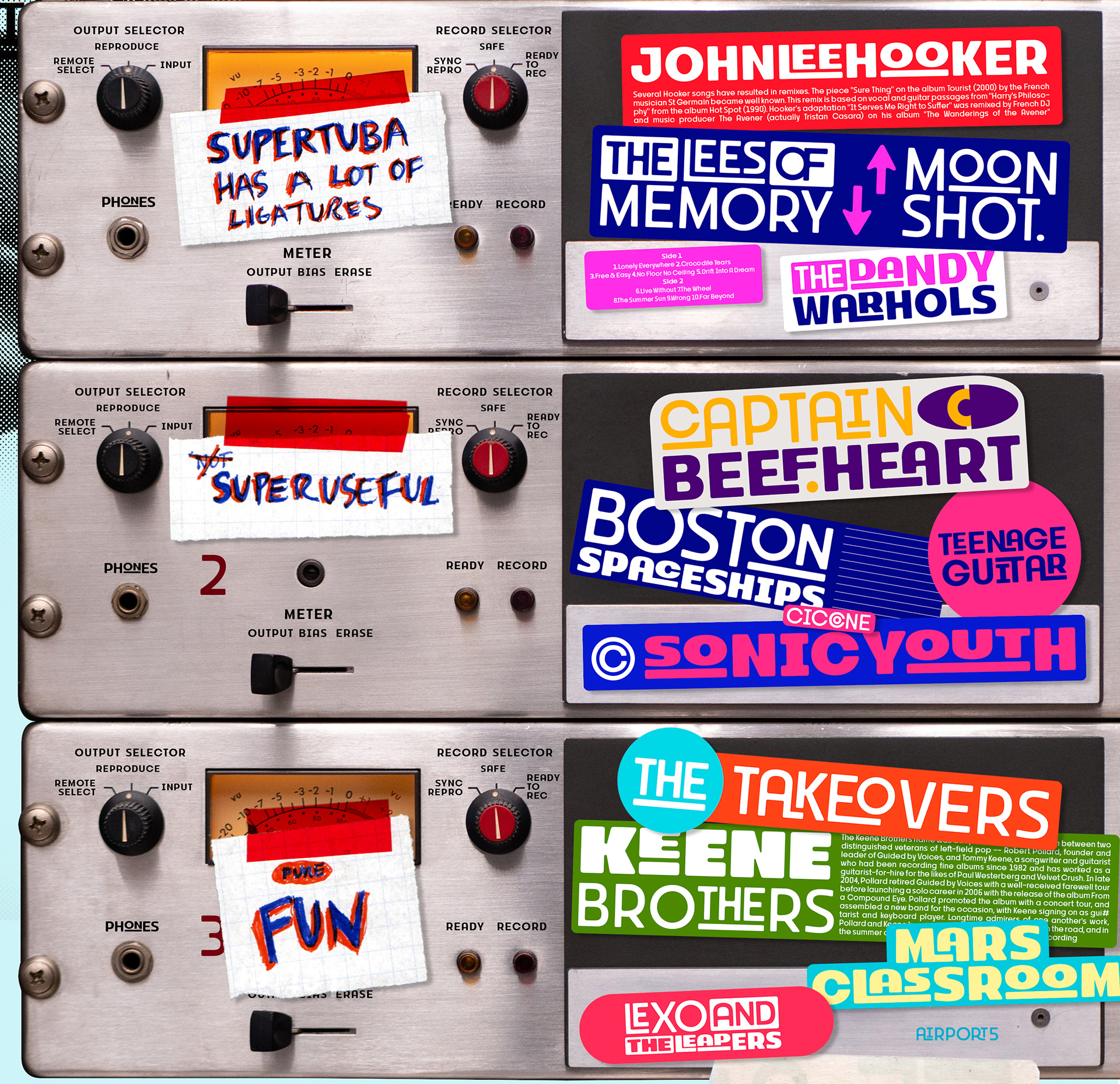
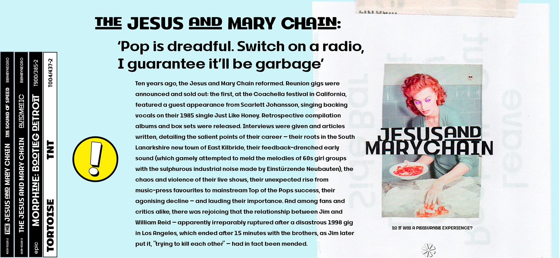
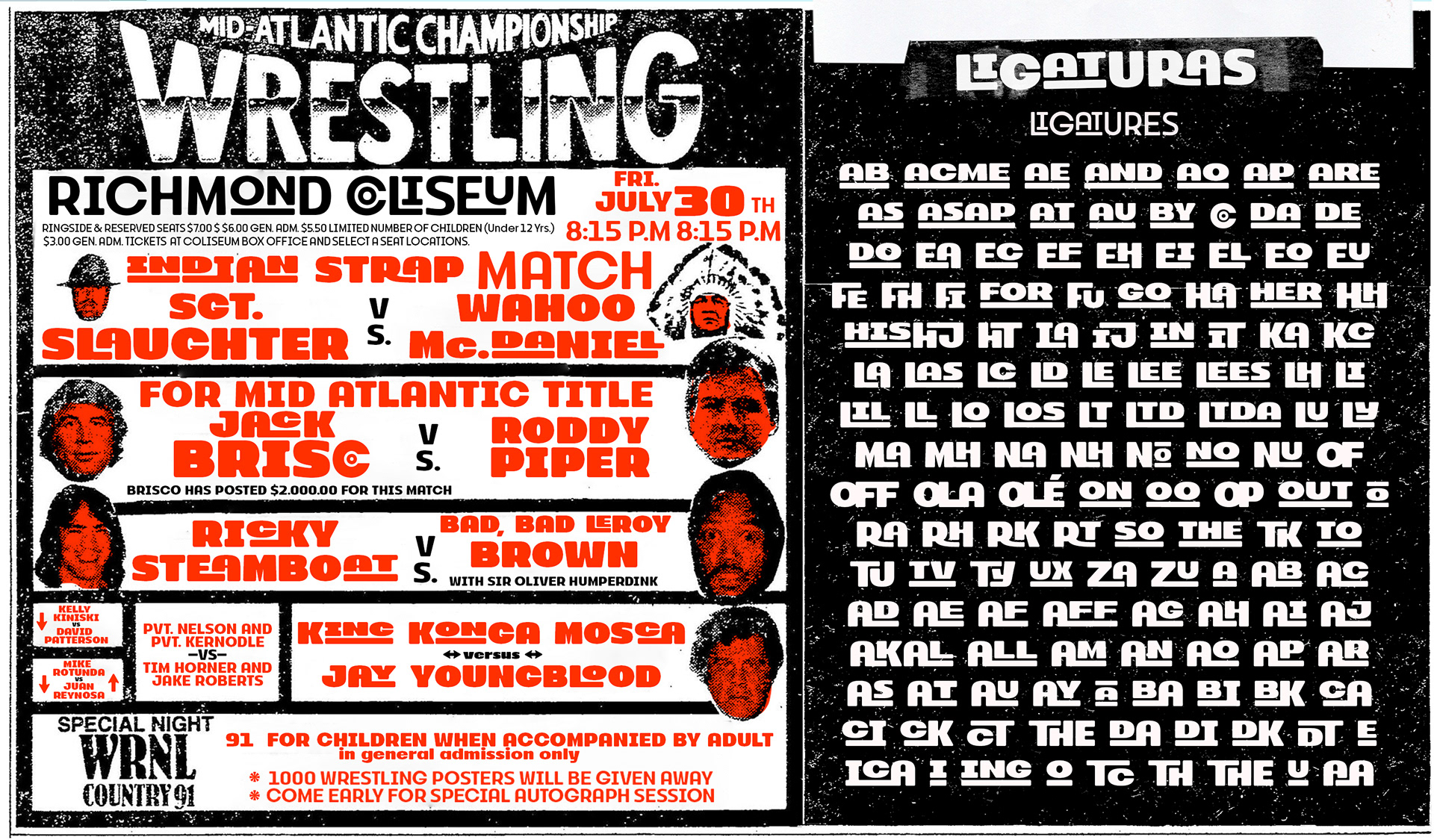
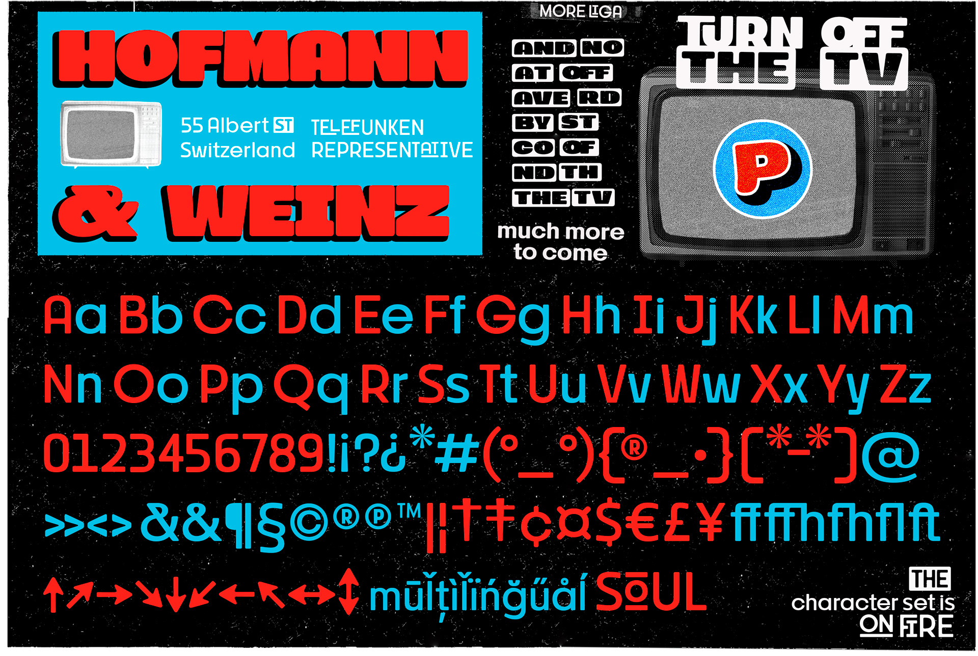
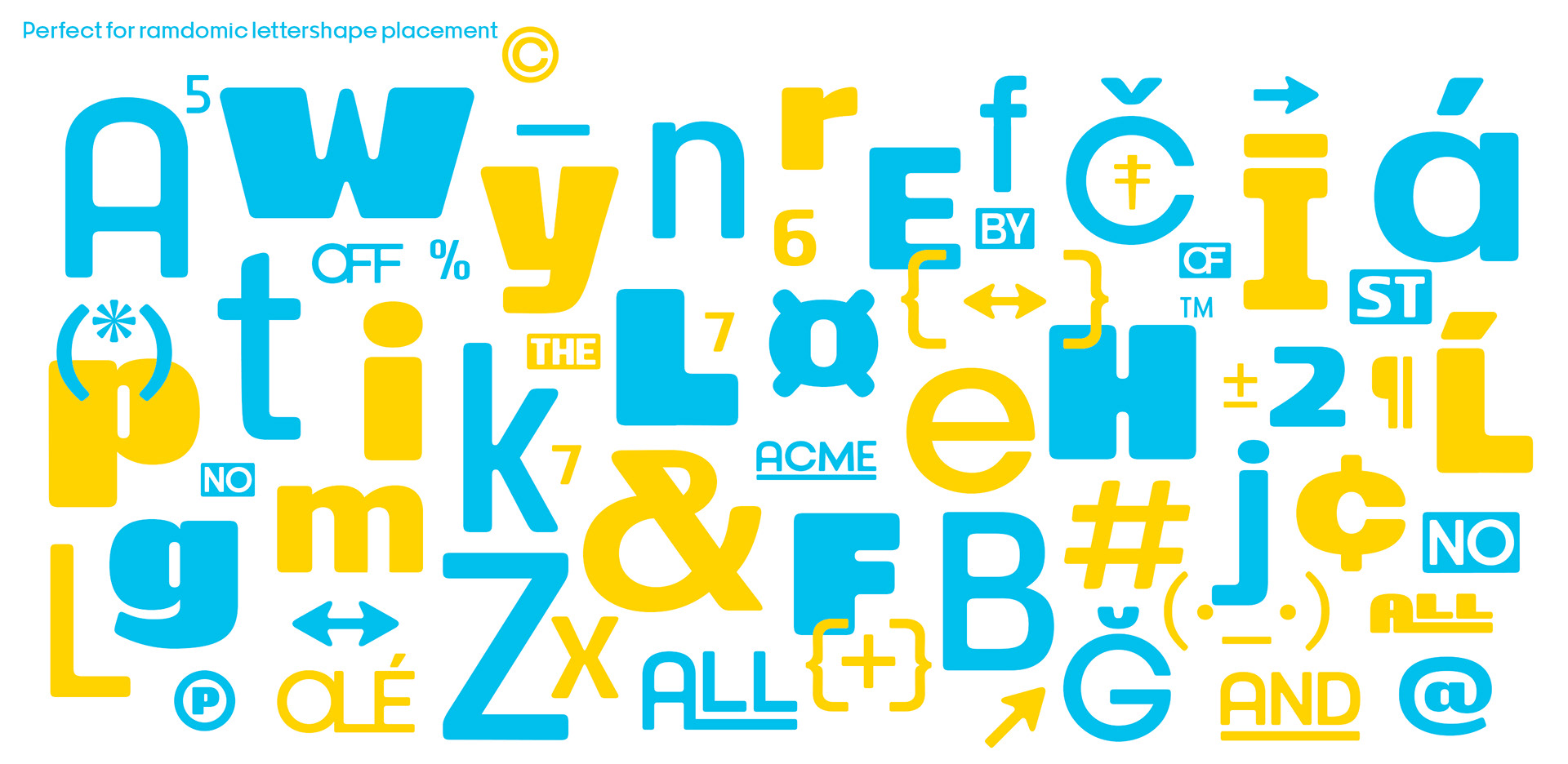
English. Supertuba is a geometric sans vernacular display type family with 6 weights and an extra variable font. There's literally dozens of ligatures in this font so It works very well for flyers, stickers and posters, also you can use it as a text font if you're looking for something bold. Supertuba has multilingual support and useful open type features. Letterboards that used to be seen in churches, dive bars and butcher shops are the main inspiration for this typeface.
Portuguese. Supertuba é uma fonte display geométrica sem serifa vernacular, tem 6 pesos e também uma fonte extra variável. Ela têm literalmente dezenas de ligaduras e funciona muito bem em flyers, logos, embalagens e também para blocos de texto, se você procura por algo um pouco mais bold. Supertuba têm suporte multilingual e algumas open type features que podem ser úteis. A ideia inicial para projetar essa fonte veio daqueles painéis de letras destacáveis de bares e lanchonetes.🖖
Supertuba is a vernacular typeface inspired by true events.
Available on • CREATIVE MARKET • MYFONTS • YWFT

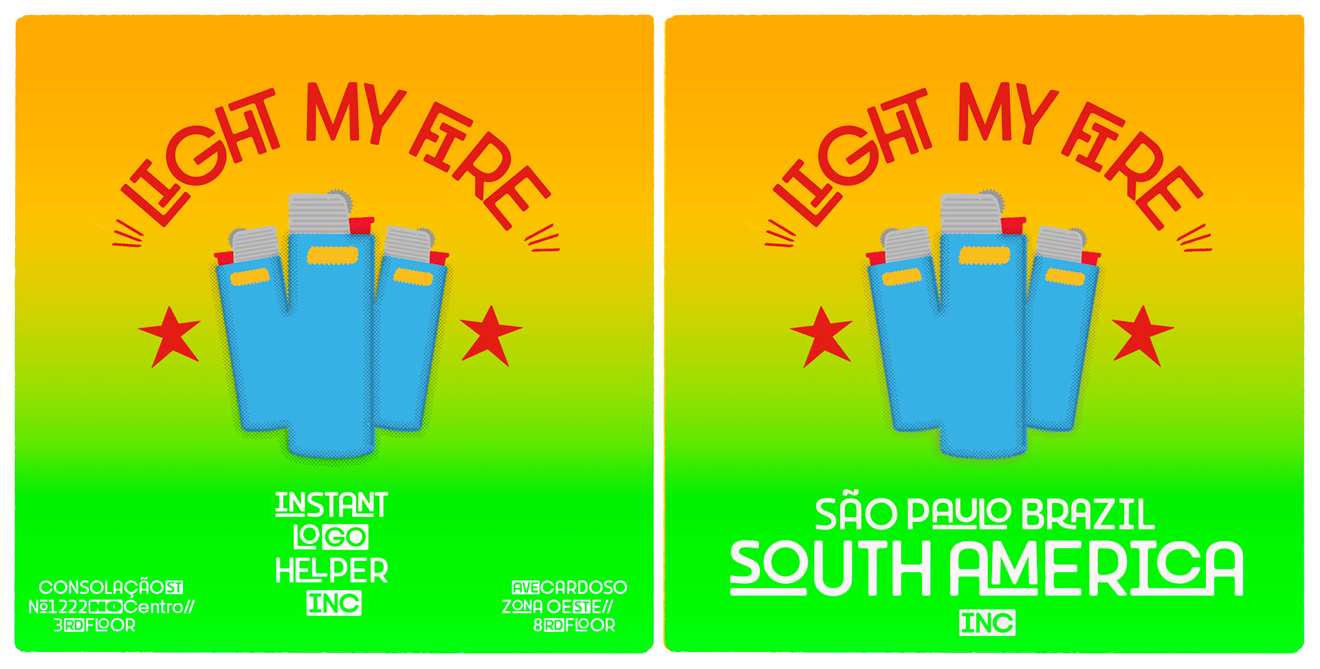

Supertuba is a vernacular typeface inspired by true events.
Available on • CREATIVE MARKET • MYFONTS • YWFT
***EXTRA***
The name Supertuba came from an old supermarket that no longer exists in the city of Indaiatuba, I believe this name is super fun (at least in Portuguese), I was kind of living there during the Covid quarantine when I started designing this typeface so this is a "homage". Supertuba is the third piece of a particular trilogy of fonts that Stubby and Stubby Rough take part, from a unpretencious vernacular drawing to an unusual geometry.
Thanks for Henrique Beier who has been supplying a whole generation of type designers with this amazing Drawbot animation tutorial.
🖖